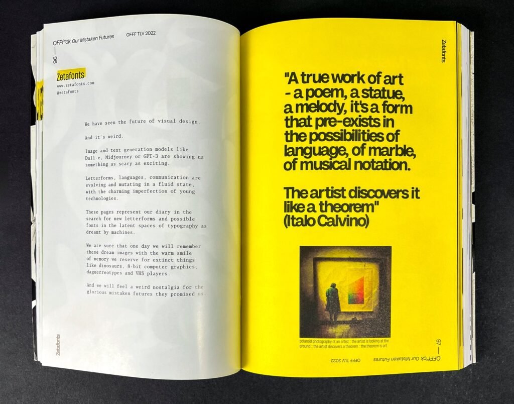
It was presented this week during the International Festival Offf TelAviv “A beautiful mistake”. Half event catalog, half experimental artistic publication, it is a project entirely dedicated to the power of errors in the creative fields, exploring the growing potential of artificial intelligence at the service of the creative professions.
In May 2022 the Italian independent type foundry Zetafonts was contacted by Nitsan Rozenberg and Liri Argov, co-directors of OFFF TLV, the Tel Aviv branch of the worldwide famous OFFF Festival, to design an event catalog for the 2022 edition of this festival, dedicated to the post-digital creation culture.
The idea behind the festival theme, described in their “OFFF*UCK manifesto” and created by Awesome studio, is that mistakes are an essential part of the creative process and that – as a creative community – we should embrace them instead of trying to avoid their manifestation.
This resonated deeply with the Zetafonts team, since making mistakes is an integral part of creative’s work. Designing typefaces is all about trying to create variations on shapes that are already perfect and making little wrong experiments in the hope that they turn out as happy solutions.
Without embracing them, we would never learn or grow, never push boundaries, or explore new territory.
The result is 256 pages curated by Isabella Ahmazadeh from the Zetafonts team, that share the excitement of a festival chock-full of inspiring ideas and insights, and that embody the spirit of OFFF: celebrating humanity, imperfections, and willingness to experiment and take risks.
And precisely as a provocative contrast to the celebration of human error, this publication was also an opportunity to explore recent developments in artificial intelligence: a particularly hot topic in this 2022, so rapidly evolving that it is destined to soon generate that strange nostalgia that we can have when thinking about VHS or 8-bit computer graphics.
“The editorial Our Mistaken Futures” — says Cosimo Lorenzo Pancini, Creative Director of the foundry — represents a diary inside the book in the search for new letterforms and possible fonts in the latent spaces of typography as dreamt by machines using Midjourney AI and Dall-E; a glimpse into the weird future made up by neural network generated typography and ai-assisted graphic design
For this central content, the award-winning foundry based in Florence has developed Deep Dream: a collection of two generated Typefaces created with the help of a Deep Neural Network from 50.000+ vector shapes. “The results are amazing, each font has a different story, some are more organic, some have a tech feel, some have a retro feel, but all of them are beautiful in their own way and can be used for any kind of project. Deep dream typefaces are here to stay and we will keep creating more and more, stay tuned!” (This description is not written by humans)
A beautiful Mistake is a collection of all the possible mistakes done by visual designers – from low-resolution images and missing fonts to misaligned text, bad overprints, lorem ipsum leftovers, and even an upside cover. Enriched by a showcase of the amazing artworks by speakers and guests of OFFF TLV 2022, it is a celebration of the creative juices, of the things done wrong that end up looking beautiful anyway.
The occasion required the use of typefaces with a strong personality, suitable for editorial use, but which could provide an uneven, unexpected rhythm — says Francesco Canovaro, CEO and Type Director foundry — and thus, in pairing with one of our top-seller fonts (Milligram) was born a new, custom, typeface thought for use in editorial situations, where readability must be married to a strong personality.
Blacker Mono, designed by Cosimo Lorenzo Pancini and Francesco Canovaro is the monospaced version of the Blacker type-family, bringing its “evil serif” aesthetics into the realm of typewriter and coding typefaces.


