



Rebranding efforts have traditionally focused on new logos.
But some of the year’s biggest rebranding efforts went in another direction: instead of updating their logos, KFC, Sprite, and Coca-Cola are doubling down on the visual assets that made them recognizable to begin with.
All three rebranding efforts have a similar logic. If a brand has spent decades creating elements that people can identify instantly, why replace them? The strategy lies in making them more relevant, flexible and consistent.
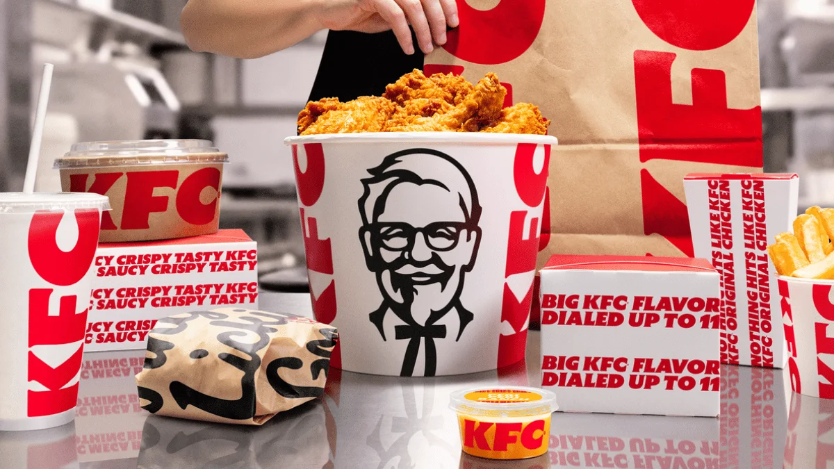
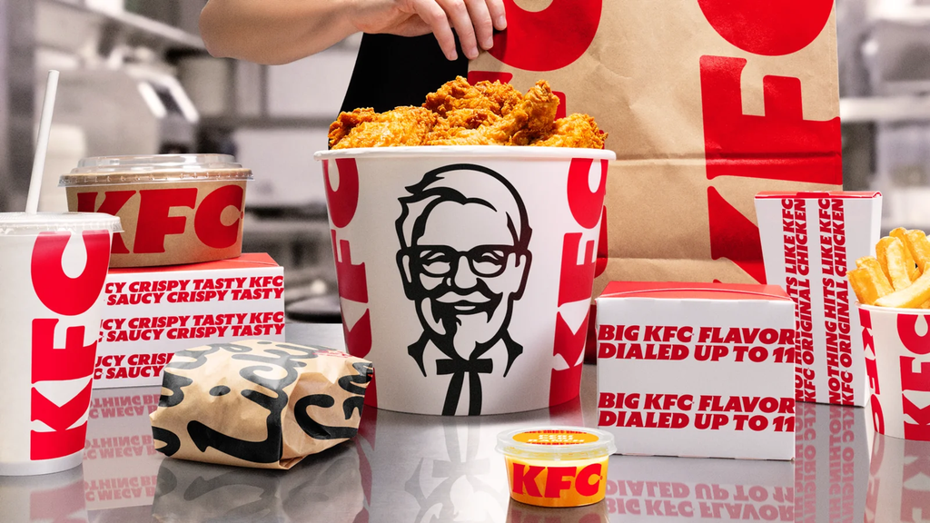
KFC puts the bucket at the center
In 2026, KFC introduced a global evolution of its brand as part of a broader transformation that includes changes to its menu, restaurants and consumer experience.
In regards to visuals, the company decided to enhance its most recognizable assets, with the KFC bucket in a protagonizing role, while subtly evolving the image of Colonel Sanders to maintain the brand’s legacy while giving the brand a more contemporary look.
KFC’s brand identity extends to packaging, digital platforms, advertising and physical spaces, allowing KFC to maintain consistent branding while growing internationally.

The Lymon is back in Sprite
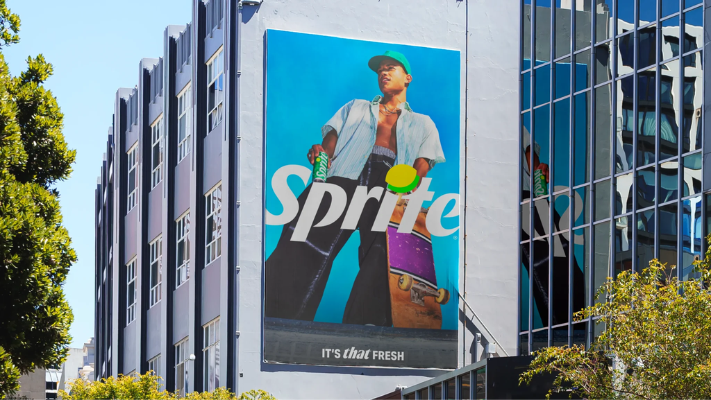
Sprite made a similar decision when revamping its global identity with forpeople.
The new strategy re-adds a slice of Lymon, a symbol that combines the shapes of a lemon and a lime, and that has accompanied the brand at different times throughout the soft drink’s history. The Lymon has since returned to the Sprite wordmark.
The rebranding effort also reorganizes the brand’s graphic designs around green and white, incorporating movement, new visual expressions and a global sound identity, Sprite Sound. The result seeks to update the brand without changing what made it recognizable.

Coca-Cola amplifies 140 years of identity
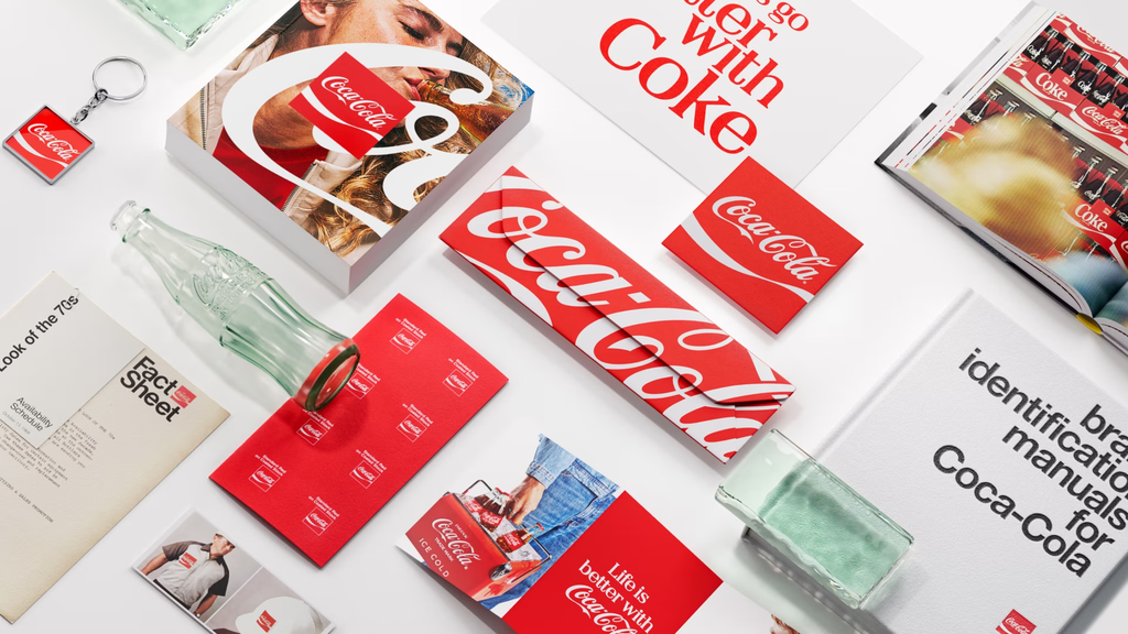
For Coca-Cola, the strategy is even more evident. JKR worked alongside the company on a global rebrand that does not replace its historic Spencerian signature, choosing to amplify some of the brand’s most recognizable elements, among them: the red and white Dynamic Ribbon — the characteristic wave – and red Arden Square, both introduced in 1969.
The new identity seeks to unify the expression of Coca-Cola across more than 200 markets, from packaging, points of sale, to digital experiences, but rather than introducing new symbols, Coca-Cola’s strategy focuses on enhancing the ones the company has built for decades.
Rebranding can also be about reminiscing
KFC, Sprite and Coca-Cola’s rebranding efforts promote the same idea: evolving a brand does not necessarily mean replacing what made it recognizable.
KFC’s bucket, Sprite’s Lymon, and Coca-Cola’s Dynamic Ribbon work because they tap into something that a new symbol can’t: memories.
These cases point to an interesting direction for contemporary branding. In an environment saturated with visual stimuli, perhaps innovation is not always about designing something new, but about identifying what elements already belong to collective memory and finding new ways to make them relevant.
Sources: KFC Global, The Coca-Cola Company, forpeople and JKR.


